

![]()
With this post I want to start a series of small posts on a specific image that I edited. I will show before and after, describing the (few) steps needed to reach the proposed result.

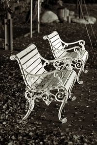
In this case, original colour image was lacking some contrast. When I did the conversion to black and white (with the channel mixer) I decided to power up the red channel (for the leaves and the white bank) and a bit on the blue channel, not to have a black stripe on the ever present trash bin. Thus I used the values 80%, 0% and 20%.
After that I did a general levels adjustment, to improve contrast by bringing back pure black and white colours.
Finally, I added a Platinum toning to add a hint of a warm tone to the picture...
Publicidad